Typography
lettering and typeface projects
Typography and type design has been a life-long obsession. In 2020 I graduated from the Type@Cooper Extended Program with a Postgraduate Certificate in Typeface Design through the Continuing Education Department of The Cooper Union.
The Type@Cooper Extended Program allowed me to study the tools and principles of digital type design through typeface design projects with a fantastic roster of teachers, lecturers, and guest critics. I had the privilege of studying with Hannes Famira, Troy Leinster, Colin Ford, Alexander Tochilovsky, Cara Di Edwardo, Ken Barber, with guests critics Petr Van Blokland, Jesse Reagan, and Tobias Frere-Jones. Below are some of my sketches from the program.


I would like to sincerely thank my teachers at Cooper; Cara di Edwardo, Hannes Famira, Colin Ford, Troy Leinster, and Alexander (Sasha) Tochilovsky.
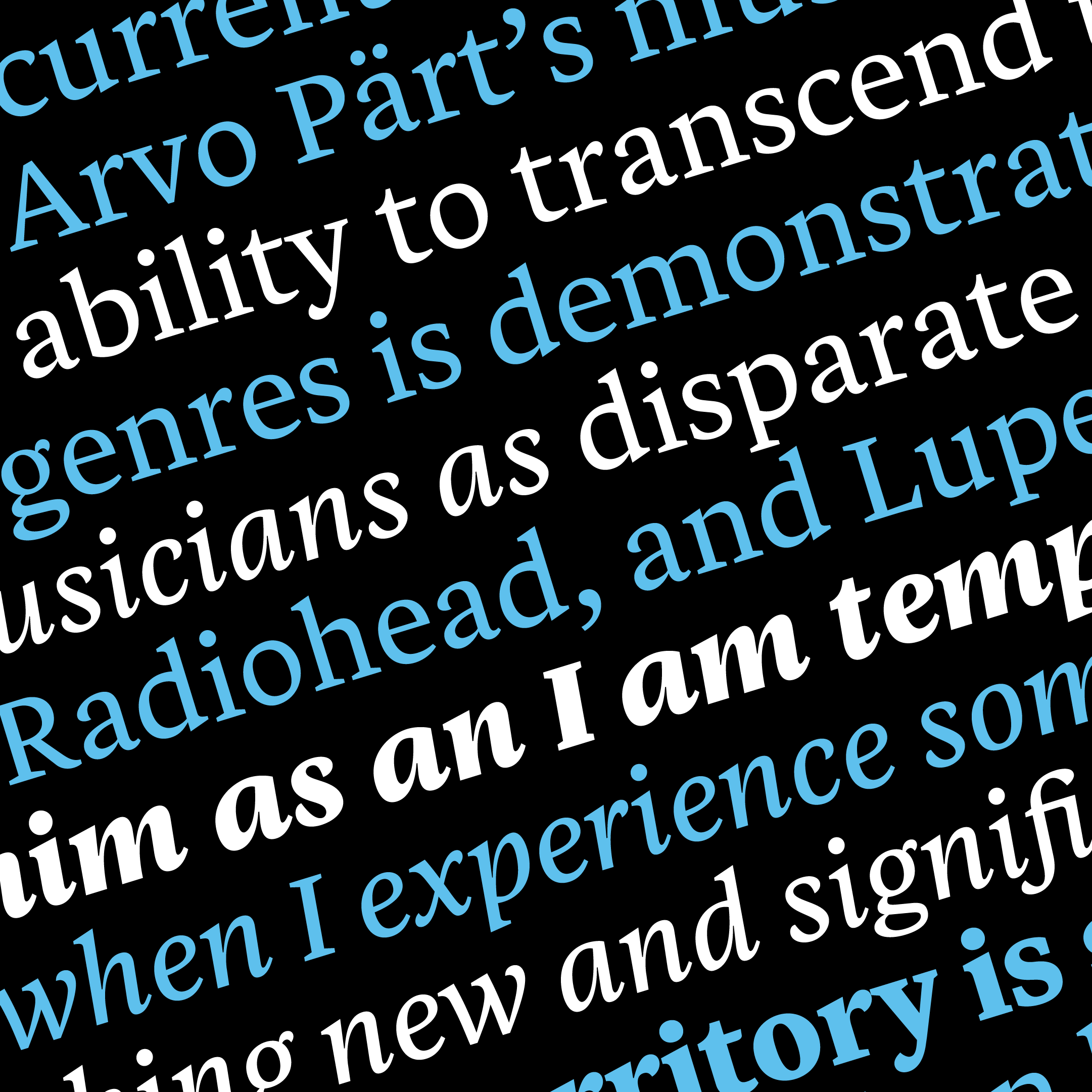
Below are are a selection of typographic and graphic design projects.

In 2014 I was approached by an American rock band to design the group’s logo and self-titled album. The basis
of the logotype is Underware’s 2004 typeface Bello.

In 2005, I was commissioned by my client, the New York City contemporary art gallery Luhring Augustine to redraw their name using the typography from the Carlsberg logo. The gallery used the art for t-shirts and collateral at the Code Art Fair located in Copenhagen – the home of the Danish brewery.

In 2006 I designed the 400 page 85th Art Directors Club Annual. For the title pages and chapter sections, I digitized Imre Reiner’s geometric blackletter font Gotika. With no examples of numerals, I interpreted my version of the 8 and 5 for the cover.